Chocolat Marilou
Branding / Identity
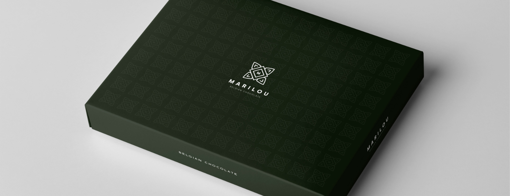
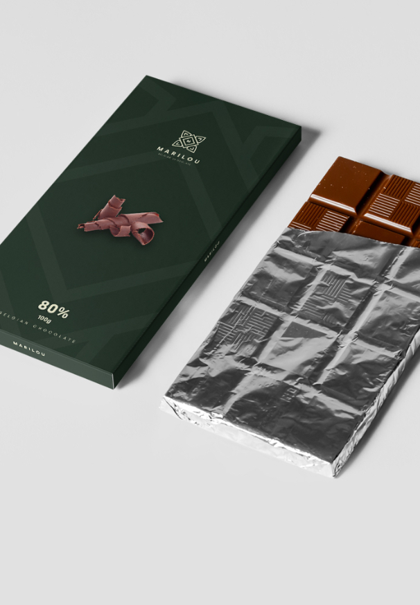
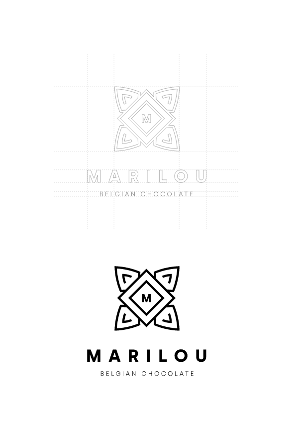
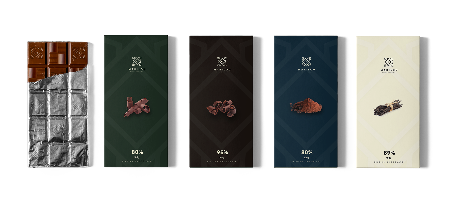
I was asked to create a logotype for a chocolate craftsman based in Belgium. The challenge was to merge chocolate and vegetable ingredients within a single brand symbol.

A piece of Geometric delicacy
I came up whit several ideas all well-suited for my client but the geometric based one marked him instantly. The square with leafs stand for chocolate tabs and cacao leafs and can also be associated with the vegetable concept. A strong sans serif font helps solidifies the logotype. This choice offers plenty of liberties.


